Round Eyes · Squirrel / Fox · Hybrid
The squirrel lash map for round eyes, built in Hybrid — zone order, where the length peaks, and the point this one usually goes wrong.
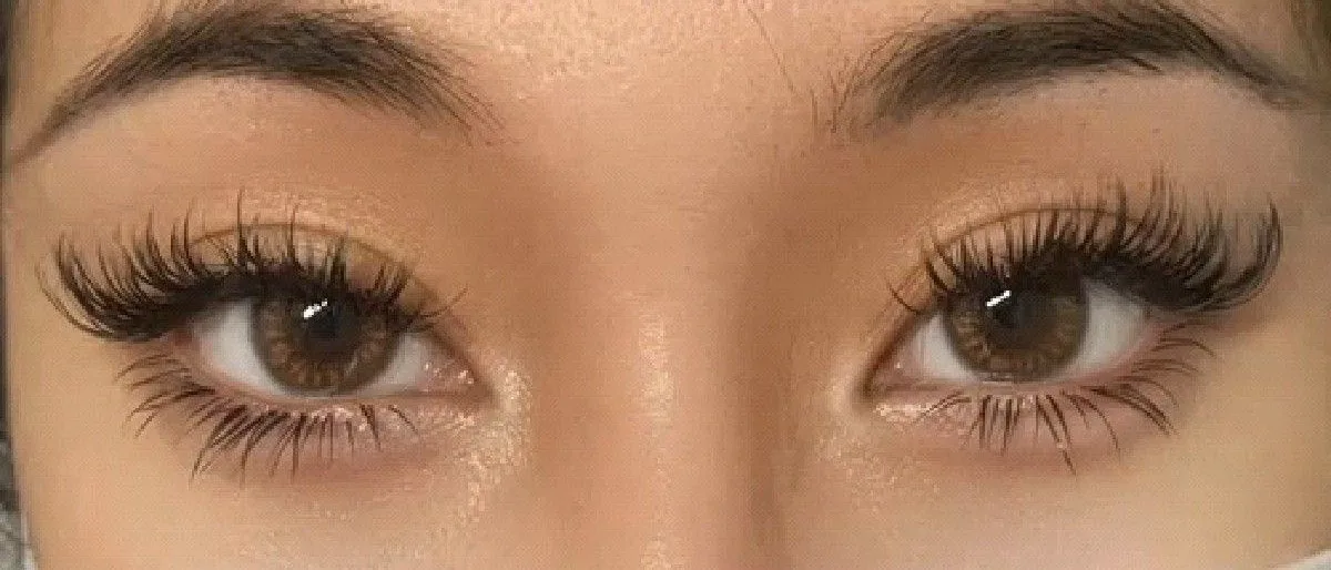
- ShapeRound — short lid line, tall opening, iris fully visible.
- EffectSquirrel with texture: one crest past centre, a soft fall behind it.
- Where everyone strugglesOnly one high point. Texture on the fall builds a second one by accident.
Why Why it is laid out this way
Think of this map as a brushstroke: heaviest as it turns, thinning as it leaves. Hybrid lets you load the texture into the first half so the crest looks generous, then take the mix down to almost nothing so the fall stays readable. That contrast is what elongates a round eye without ever lifting the middle of it.
The order the zones go on, and where the fans land
- Draw the curve in singlesSet the rise, the crest one zone past the middle, and the matching fall, all in single strands first.
- Load texture on the way upFans and mixed lengths through the inner and mid zones give the climb body while the lengths are still modest.
- Keep the crest to one pointThe peak zone stays the tallest thing on the lid and stands alone. Nothing beside it may match it.
- Thin the mix on the fallPast the crest, drop back toward singles. A clean descent is what tells the eye the shape is deliberate.
- End with a few short strandsA scatter of shorter singles at the corner softens the finish without lengthening it.
The length curve on round eyes
The picture above is one turn: up through the inner half, over just past the middle, down again at the same rate. Hybrid does not move any of those lengths, it changes their density — full on the climb, sparse on the fall — so the shape gains weight where it needs presence and loses it where it needs to fade. A round eye reads that gradient as horizontal movement, which is the only kind it wants.
Where does a squirrel map go wrong on round eyes?
Deep The physics underneath
Density and length are two separate dials here, and this cell turns them in opposite directions across the lid.
The same map, built four ways
- Classic 1:1
- Singles carry the crest and everything past it, where exact lengths make the fall legible. They are also the lightest thing to put on the outer lashes, which are being asked to hold a visible taper rather than just exist.
- Handmade volume
- The adjustable fan is what makes the climb look full without making it long — open on the inner zones, closing as you approach the turn. That taper in spread is a second gradient running under the length gradient, and it is what sells the shape.
- Promade / pre-made fans
- A fixed width does the inner climb well enough and then keeps giving you the same fill when you want less. If you reach for them, stop at the zone before the crest and finish by hand.
- Woven / clover
- The shared bond covers ground quickly across the strong middle lashes on the way up. Past the turn it works against you, since the whole point of the descent is that the strands thin out and a woven join keeps them tied together.
Spread angle versus weight
On this map spread should shrink as length grows, which is the opposite of what feels natural. Wide fans on the short inner zones close the line cheaply; at the crest, where the longest strands sit on lashes past their strongest point, width becomes torsion on the one strand you cannot afford to lose. Narrow at the turn, narrower still on the fall.
What a round lash line can carry
- The crest is the only zone on this map with no margin — longest reach, densest work, and lashes that have started to taper. Everything either side of it is comfortable by comparison.
- Mixing textures means neighbouring lashes carry unequal loads, so a zone can look even and still be failing in patches. Check the fine strands inside the crest before you decide how much texture it gets.
- The descent is cheap to build and cheap to lose. That is an advantage: budget it thin so a few missing strands never break the shape.
Where this map fails first
Failure starts on the inner shoulder of the crest, not at the corner. That is where the fullest texture meets the longest lengths, so it is the heaviest point on the lid, and any fan there that is a touch wide will rotate before it sheds. Once it rotates the crest looks blunt and the map reads as a low natural set. The corner, being the lightest part of the map, usually outlives it.
FAQ Common questions
Where should the texture be heaviest on a squirrel map?
On the way up to the crest. Loading the climb gives the shape presence, and thinning the fall keeps the descent visible.
Can I put spikes past the peak?
Better not. Anything tall behind the crest creates a second high point and the curve stops reading as one clean turn.
Why not make the peak two or three zones wide?
Because a wide top is a plateau, and a plateau over a round eye adds height rather than length. One zone stands longest, everything else steps away from it.
Is hybrid better than volume for this shape?
It is easier to keep light, which matters when the crest sits past the strongest part of the lash line. Volume is fine here, but it takes more discipline to stop the fall filling in.
Print this page or save it as PDF — the diagrams are drawn to stay readable in black and white on plain paper. Or download the diagrams below as SVG. No account, no fee, nothing to sign. Every file carries this page’s address, so wherever it ends up it can be traced back here.
Teaching from these? The offer, and how to credit it.
Also in: Round eyes · Squirrel / Fox · Hybrid
Read next: fox eye and squirrel lash mapping, and how they differ · questions clients ask about lash extensions